Tips and cases of use for a successful WordPress website with calculated forms.
Categories: Form Features, Design & Layout
Customizing the design of forms by selecting between predefined templates, rewriting of plugin's styles, and/or defining new ones.
Introduction
Forms templates
Customizing styles
"Advanced Settings" tab in fields' settings
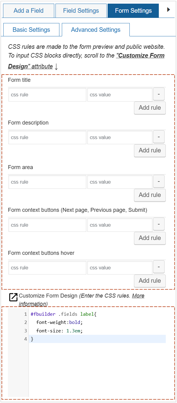
CSS editor in the "Form Settings" tab
Tags structure
Fields class names
Other class names
Customizing specific fields
Customizing specific forms
In the WordPress environment there are as many themes available as imaginative developers, and for a plugin like the "Calculated Fields Form", whose aims is create general purpose forms, the ability to personalize form designs to suit the themes becomes a must.
The "Calculated Fields Form" plugin includes multiple alternatives to modify the forms designs:
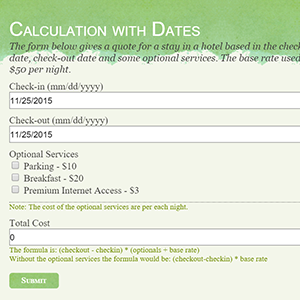
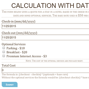
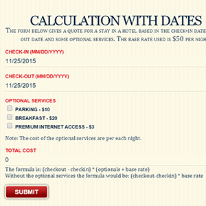
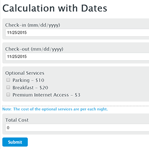
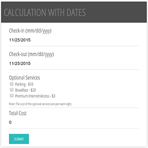
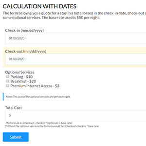
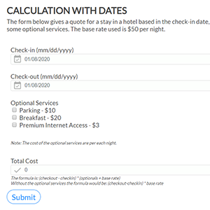
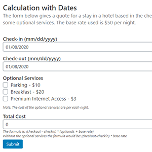
The "Calculated Fields Form" plugin is distributed with multiple predefined templates, selectable through the "Form Template" attribute in the "Form Settings" tab:
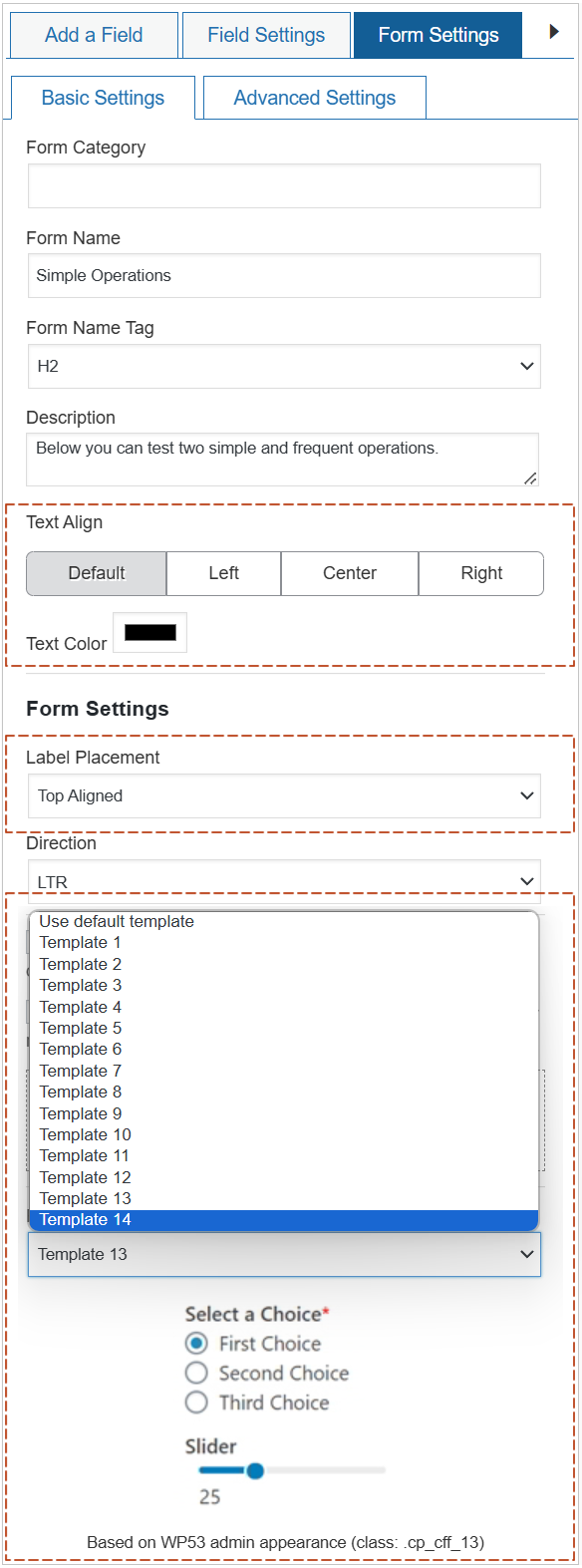
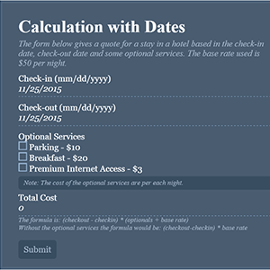
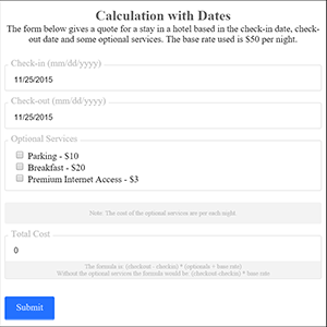
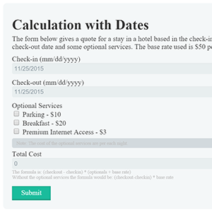
The templates' designs are varied, they include different colors combinations, visual effects, different controls' appearances, fonts' sizes, and more:
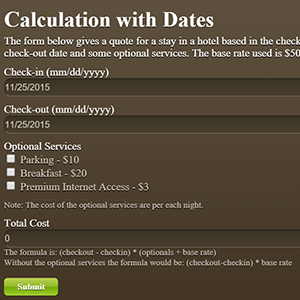
More information about create custom templates by reading the following post, How do I create a new template to use with my forms?
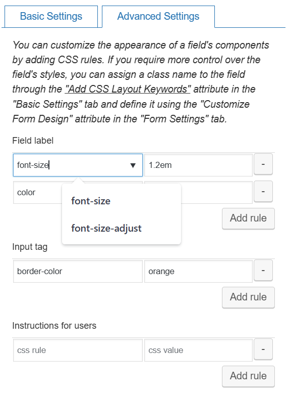
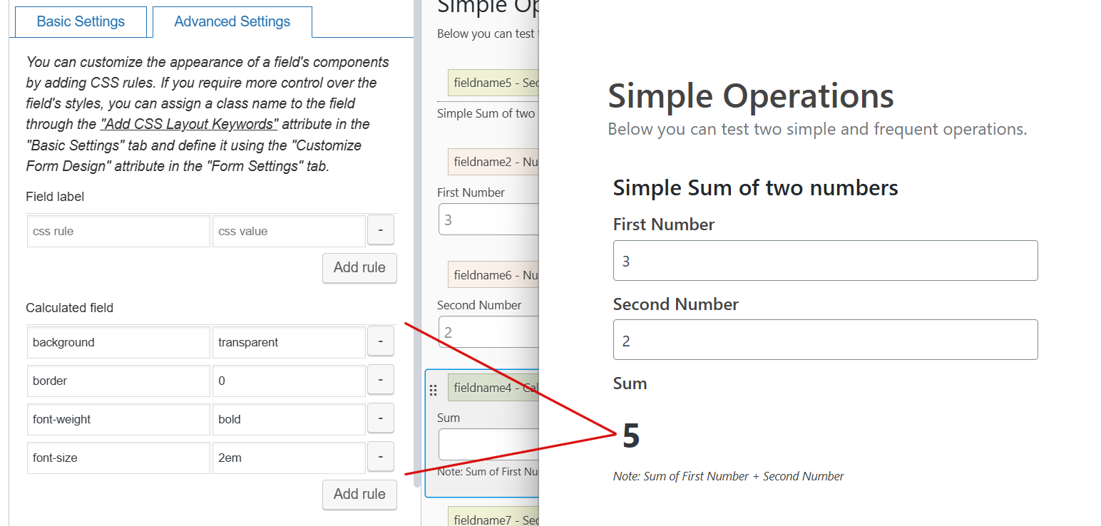
The "Advanced Settings" tab in the fields' settings allows you to enter CSS rules for customizing the design of various field components. These components vary depending on the specific field you are editing (labels, input fields, instructions for users, choices, others).
Feel free to explore the available customization options within the "Advanced Settings" tab to create a more tailored and visually appealing experience for your users!
For example, if you want to customize the appearance of the calculated field result, like making the input box transparent with no borders, follow the steps below:
Additionally, the plugin includes a rich CSS editor in the "Form Settings > Advanced Settings" tab, with syntax highlighting and error checking:
Before listing the plugin's styles, and include some examples about their use, I'll describe the DOM structure of form, the tags that compound the fields, the header and buttons in the form.
All forms' content is enclosed into a DIV tag with an unique id:
<div id="fbuilder"></div>
The fields' structure is made-up by different components, the LABEL, the INPUT tag (some fields include SELECT, TEXTAREA, or a combination of these tags), the instructions for users.
For example, the following piece of code shown the HTML structure of a calculated field:
<div class="fields cff-calculated-field">
  <label for="fieldname4_1">Field label</label>
  <div class="dfield">
    <input id="fieldname4_1" name="fieldname4_1" type="text">
    <span class="uh">Instructions for users</span>
  </div>
</div>
To set in bold the labels of all calculated fields in the form, it is possible the use of following style definition:
#fbuilder .cff-calculated-field labe{font-weight:bold;}
To customize the appearance of INPUT tags of calculated fields:
#fbuilder .cff-calculated-field input{
    border:0;
    background:transparent;
    font-size:2em;
}
Other fields have more complex tags structure.
Date field:
<div class="fields cff-date-field">
  <label for="fieldname1_1_date">Check-in <span class="dformat">(mm/dd/yyyy HH:mm)</span></label>
  <div class="dfield">
     <input id="fieldname1_1_date" name="fieldname1_1_date" class="field datemmddyyyy date-component" type="text" value="">
     <select id="fieldname1_1_hours" name="fieldname1_1_hours" class="hours-component"></select>:
     <select id="fieldname1_1_minutes" name="fieldname1_1_minutes" class="minutes-component"></select>
     <select id="fieldname1_1_ampm" class="ampm-component"></select>
     <span class="uh">Instructions for user</span>
   </div>
</div>
Slider field:
<div class="fields cff-slider-field">
  <label for="fieldname6_1">Slider</label>
  <div class="dfield slider-container">
    <div id="fieldname6_1_slider" class="slider">
      <div class="ui-slider-range"></div>
      <span class="ui-slider-handle"></span>
    </div>
    <div class="corner-captions">
      <span class="left-corner">0</span>
      <span class="right-corner" style="float:right;">100</span>
    </div>
    <div class="slider-caption">0</div>
    <span class="uh">Instructions for users</span>
  </div>
</div>
Section Break field:
<div class="fields section_breaks">
  <div class="section_break"></div>
  <label>Section Title</label>
  <span class="uh">Instructions for users</span>
</div>
Form header:
<div class="fform">
  <h2>For title</h2>
  <span>Form description.</span>
</div>
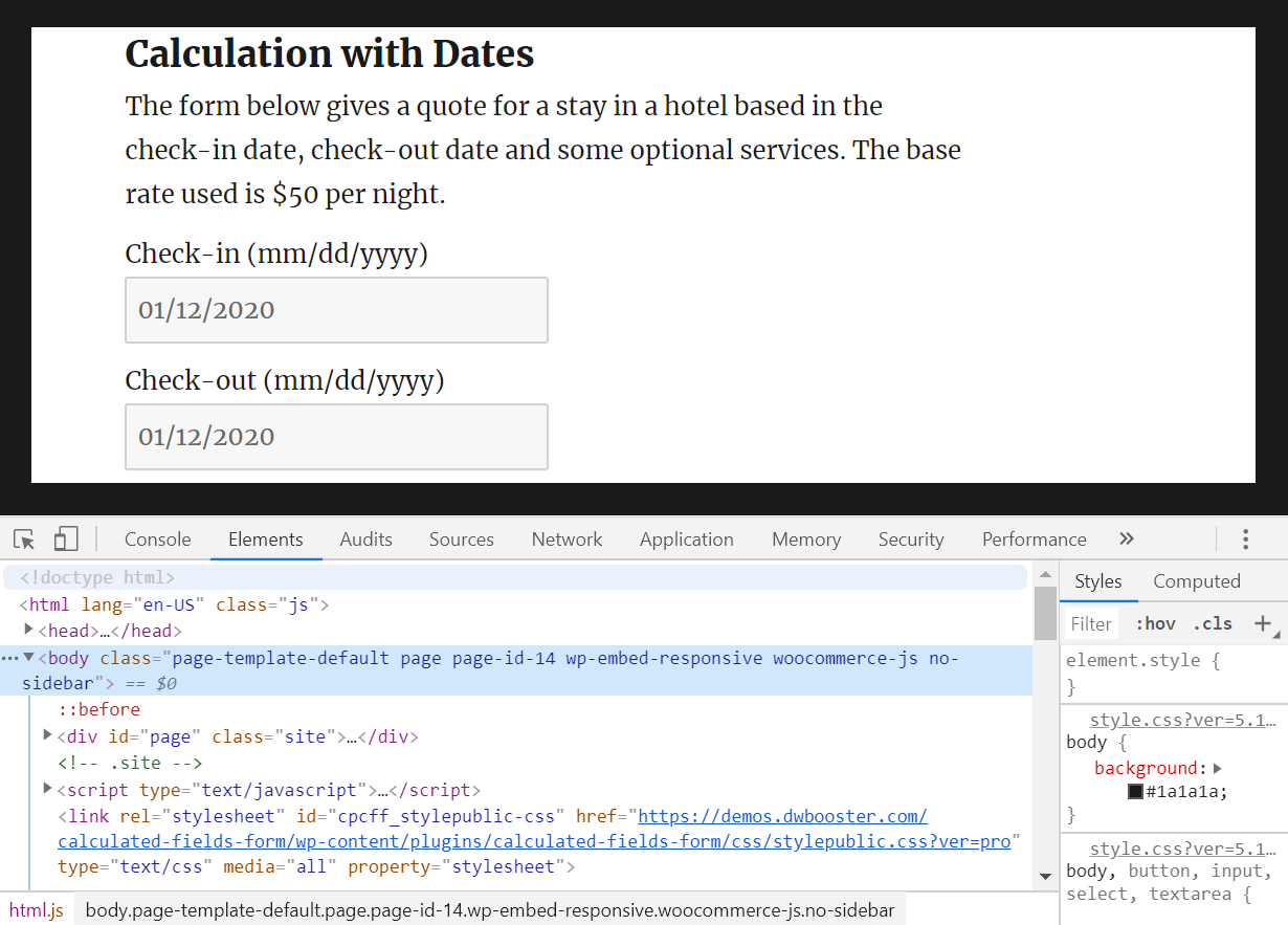
It is possible to check all form and fields' tags through the Browser's Developer Tools:
The list of class names assigned to the forms fields is:
Single Line Text: .cff-text-field
Currency: .cff-currency-field
Number: .cff-number-field
Slider: .cff-slider-field
The slider control includes other class names:
.ui-slider-handle applied to the sliders' handlers.
.ui-slider-range applied to the active bar.
.slider applied to the sliders' background bars.
.corner-captions applied to the container for the left and right corner captions.
.left-corner applied to the left corner caption.
.right-corner applied to the right corner caption.
.slider-caption applied to the slider caption.
Email: .cff-email-field
Date Time: .cff-date-field
The Date Time control includes other class names:
.date-component applied to the date component in the date/time field.
.hours-component applied to the hours component in the date/time field.
.minutes-component applied to the minutes component in the date/time field.
.ampm-component applied to the dropdown field for selecting between the am/pm if the date/time is formatted as 12 hours.
.dformat applied to the section of field's label with the date format
Text Area: .cff-textarea-field
Checkboxes: .cff-checkbox-field
Radio Buttons: .cff-radiobutton-field
Dropdown: .cff-dropdown-field
Upload File: .cff-file-field
Password: .cff-password-field
Phone field: .cff-phone-field
The phone field includes other class names:
.l applied to the text with the phone number format ### ### ####
Ex. Hiding the text with the phone number format:
#fbuilder .cff-phone-field .l{display:none;}
Instruct. Text: .comment_area
Hidden: .cff-hidden-field
Section break: .section_breaks
Summary: .cff-summary-field
Media: .cff-media-field
Button: .cff-button-field
HTML Content: .cff-html-field
Calculated Field: .cff-calculated-field
Fieldset: .cff-container-field
Div: .cff-container-field
RecordSet DS: .cpcff-recordset
Some examples:
Increasing the font size of section break labels:
#fbuilder .section_breaks label{font-size:2em;}
Displaying the calculated field as a floating frame aligned at right of the page's content:
#fbuilder .cff-calculated-field{
  position: fixed;
  width:200px;
  padding: 20px;
  background: white;
  rigth: 10px;
  top: 250px;
  z-index: 9999;
}
Hiding the texts with the date format from the labels of date fields:
#fbuilder .cff-date-field .dformat{display: none;}
Class names assigned to the forms' buttons:
Submit button: .pbSubmit
Previous page button: .pbPrevious
Next page button: .pbNext
Ex. changing the background and text colors of the submit and navigation buttons:
#fbuilder .pbSubmit{color:white; background:black;}
#fbuilder .pbPrevious,
#fbuilder .pbNext{color:yellow; background:black;}
Class names applied to the form header:
The form header has assigned the .fform class name, and it is composed of a h2 tag with the form title, and a span tag with the form's description.
Ex. modifying the text color of form's title, and its description in italic:
#fbuilder .fform h2{color:green;}
#fbuilder .fform span{font-style:italic;}
Class names applied to multiple fields:
Class name applied to all "Instructions for User" texts: .uh
Ex. display all instructions for users in italic:
#fbuilder .uh{font-style:italic;}
Class name applied to the tooltips (when the Instructions for users are displayed as tooltilps): .uh-tooltip
Class name applied to the span tag with the asterisk for the required fields: .r
Ex. apply blue color to the asterisk symbol:
#fbuilder .r{color:blue;}
So far, has been described how to modify the appearance of all fields of same type in the form, for example, to all calculated fields, all phone fields, etc. But how to modify the appearance of an unique field in the form?
The first alternative is to modify the fields' designs through the "Advanced Settings" tab in their settings.
The second approach necessitates assigning a class name to the field. This method allows you to apply a consistent design across multiple fields, eliminating the need to repeatedly input identical CSS rules. This efficiency prevents duplication of effort and streamlines the design process.
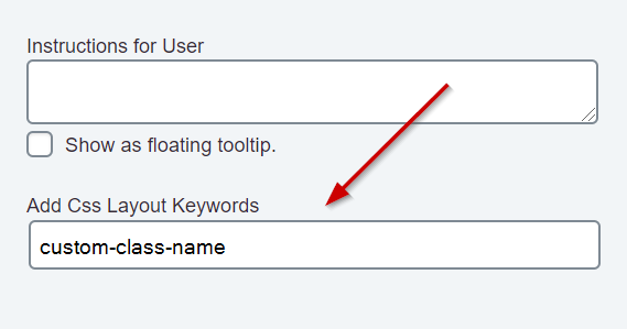
All fields include the "Add CSS Layout Keywords" attribute in their settings. This attribute allows you to assign specific class names to the fields:
The process would be as follows:
Assigns a class name to the field, through its "Add CSS Layout Keywords" attribute, for example: custom-class-name
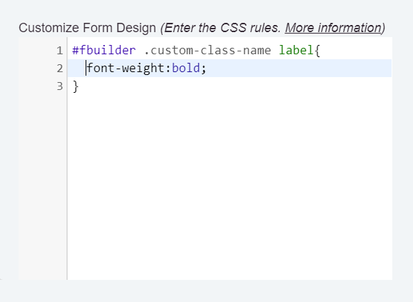
Defines the new class name through the "Customize Form Design" attribute in the "Form Settings" tab.
For example, for displaying the field's label in bold:
#fbuilder .custom-class-name label{font-weight:bold;}
If there were inserted multiple forms in a same page, and was included the style definition below in one of them:
#fbuilder .cff-calculated-field input{font-size:2em;}
This style would affect to all calculated fields in the page, no matter the form where the field is.
The workaround requires to assign a class name to the form, and use the new class name in the style definition.
To assign a class name to the form, includes the class attribute into its shortcode, for example:
[CP_CALCULATED_FIELDS id="1" class="custom-form"]
and then, the style definition should be modified as follows:
.custom-form #fbuilder .cff-calculated-field input{font-size:2em;}
