Tips and cases of use for a successful WordPress website with calculated forms.
Categories: Form Features, Design & Layout
Display the fields in the form as a list (one below the other) is not always the recommended design, because the form can become too long and bored, and distribute the fields in columns (display some fields beside the others) would be properly solution.
There are many situations where is common to see fields distributed side by side, like the first name and last name in contact forms, the street name and house number, scientific degree and person name, etc. so, distribute the fields in columns is very important in the forms' development.
The "Calculated Fields Form" plugin offers different alternatives to distribute the fields in columns. I'll describe first the methods supported by the original versions of the plugin (which are still supported for compatibility reasons), and then, I'll talk about the new layout, included with the latest update of the plugin, that guarantee more flexibility and emulates very popular libraries like: Bootstrap or Flexbox Grid.
Note 1: The class names are assigned to the fields through the attribute: "Add CSS Layout Keywords" in their settings. Every time I talk about assign a class to a field, that means to enter the class name through the "Add CSS Layout Keywords" attribute.
Note 2: To a same field can be assigned multiple classes. These class names should be separated by blank characters.
The first method requires the use of container fields. The plugin includes two container controls: DIV and Fieldset.
To distributed the fields in columns using containers:
The container fields accept a maximum of 12 columns, however you can nesting multiple container fields to generate rows with more columns. For example, if you insert a container field with 2 columns, and other two container fields into it with 12 columns each of them, would be possible to create a row with 24 columns)
The second alternative requires the use of the predefined class names: column2, column3, column4, column5, column6, column7, column8, column9, column10, column11, and column12. These classes should be read as follows: the width of field with the class name column2 would be a 50% of its container's width (the row would be split in two parts), the width of the field with the class name column3 would be the 33% of its container's width (the row would be split in three parts), and in a similar way the width of the fields with the class name column4 would be a 25% of their container's width, and so on.
These class names should be applied to consecutive fields. For example, assuming you want to display two fields side by side, assign both the class name: column2, or if you want to display four fields in the same row, assign to them the class name: column4
The methods described above are very restrictive, because allows only two states: in wide screens the fields are distributed in columns, but with small screens (like small tablets and smartphones) the plugin shows every field in its own row, with only one columns expanded to the form's width.
The new columns layout system (the recommended one) emulates the behavior of very popular css frameworks, like Bootstrap or Flexbox Grid. This columns system is much more versatile, and allows controlling the forms' appearance for different screen sizes.
The columns layout system includes four groups of tags: xs, ms, md, and lg for very small, small, medium and large screens' (or viewports) sizes. The xs group has precedence in screens' sizes lesser than 48em, the ms group has precedence in screens' sizes between 48em and 64em, the md group in screens' sizes between 64em and 75em, and the lg group in screens greater than 75em.
The class names in every group are:
In the xs group: For columns: col-xs-1, col-xs-2, col-xs-3, col-xs-4, col-xs-5, col-xs-6, col-xs-7, col-xs-8, col-xs-9, col-xs-10, col-xs-11 and col-xs-12
For offsets: col-xs-offset-1, col-xs-offset-2, col-xs-offset-3, col-xs-offset-4, col-xs-offset-5, col-xs-offset-6, col-xs-offset-7, col-xs-offset-8, col-xs-offset-9, col-xs-offset-10 and col-xs-offset-11
In the ms group:
For columns: col-sm-1, col-sm-2, col-sm-3, col-sm-4, col-sm-5, col-sm-6, col-sm-7, col-sm-8, col-sm-9, col-sm-10, col-sm-11 and col-sm-12
For offsets: col-sm-offset-0, col-sm-offset-1, col-sm-offset-2, col-sm-offset-3, col-sm-offset-4, col-sm-offset-5, col-sm-offset-6, col-sm-offset-7, col-sm-offset-8, col-sm-offset-9, col-sm-offset-10 and col-sm-offset-11
In the md group:
For columns: col-md-1, col-md-2, col-md-3, col-md-4, col-md-5, col-md-6, col-md-7, col-md-8, col-md-9, col-md-10, col-md-11 and col-md-12
For offsets: col-md-offset-0, col-md-offset-1, col-md-offset-2, col-md-offset-3, col-md-offset-4, col-md-offset-5, col-md-offset-6, col-md-offset-7, col-md-offset-8, col-md-offset-9, col-md-offset-10 and col-md-offset-11
In the lg group:
For columns: col-lg-1, col-lg-2, col-lg-3, col-lg-4, col-lg-5, col-lg-6, col-lg-7, col-lg-8, col-lg-9, col-lg-10, col-lg-11 and col-lg-12
For offsets: col-lg-offset-0, col-lg-offset-1, col-lg-offset-2, col-lg-offset-3, col-lg-offset-4, col-lg-offset-5, col-lg-offset-6, col-lg-offset-7, col-lg-offset-8, col-lg-offset-9, col-lg-offset-10 and col-lg-offset-11
Unlike the previous methods, a row is split in 12 columns, and the width of every class represents the number of columns occupied, for example: the width of col-xs-1 is a 8.33% percent of the row, the width of col-xs-2 is a 16.66% percent of the row, the width of col-xs-3 is a 25% percent of row (a quarter of row's width), and so on until the col-xs-12 that represents the 100%.
Another difference is the existence of new classes for the offsets (the gutters between columns). With the previous methods it is not possible to separate the columns without defining your custom CSS classes. names.
Ex. 1:

The first row has two fields, the first one with the class name: col-xs-1 and the second field the class name: col-xs-11 (the first field occupates one column, and the second field eleven columns). Remember a row is divided into 12 columns.
The second row has two fields, the first one with the class name: col-xs-2 and the second field the class name: col-xs-10 (twelve columns in total)
The third row has two fields, the first one with the class name: col-xs-3 and the second field the class name: col-xs-9
But pay attention to the fourth row, that includes a gutter between the first and second fields. This appearance is gotten assigning to the second field an offset to complete the 12 columns. This means to assign to the first field the class name: col-xs-3 but to the second one you should assign the class names: col-xs-8 col-xs-offset-1 (summing between the fields' columns and the offset the space corresponding to 12 columns)
Ex. 2:
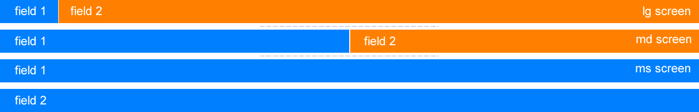
This second example describes how to configure a pair of fields to modify their distribution based on the screen's size.
The first case represents the fields' sizes in large screens (one and eleven columns). The second case represents the fields' distribution in screens with medium size (six columns each). And the last case shows every field in its own row and would be applied in to small and very small screens.
To get this behavior the class names to assign the fields are:
To the first field: col-xs-12 col-sm-12 col-md-6 col-lg-1
To the second field: col-xs-12 col-sm-12 col-md-6 col-lg-11
